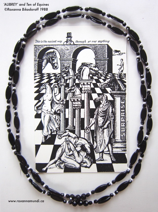
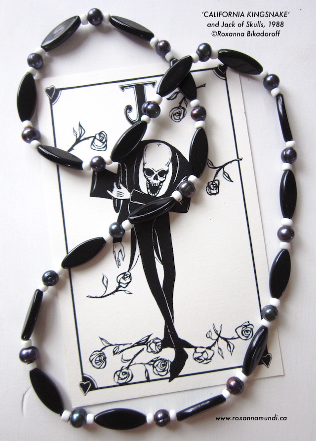
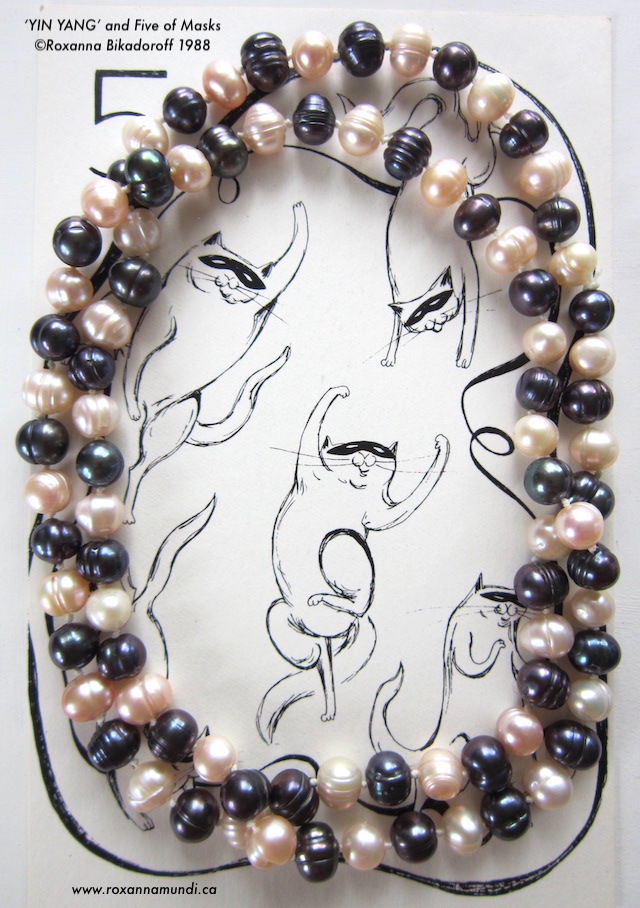
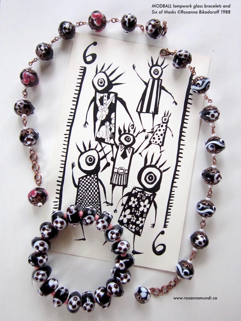
Ink on paper. That’s where it all began. I still love the simple elegance of black and white, symbolic of polarities; Fortuna with her half-and-half face, tiles on the Mason lodge floor, chess, the Yin Yang…
This Fall, I’m focusing my accessories on this simple, classic colour combo. For the sake of an interesting photo-shoot, I paired them with cards from a deck I created as a promo when first starting out as an illustrator in 1988. The 4 suits were: masks, skulls, equines and serpents. At the time it was my Magnum Opus, but turns out it was just a warm-up. Strange to think there was only a space of 10 years between publishing that one and starting the next, they’re so completely different.
Besides the current Opus (Tarot deck), am also working on a few side projects, including black and white fortune-telling cards (read about that one here). Lots to do, none of it lucrative yet, so needs we must make prêt-à-porter.
You can find more photos and details (size, materials, pricing) on the necklaces and bracelets pages in the Jewelry drop-down menu. New pieces will be added as they are completed. ~rb
Back in 1994, when I made decent money as an editorial illustrator and had extra for personal projects and crazy promotional material…in the days before digital files, websites and steampunk, I created this little ‘deck’ of illustrated Fortune Cookie cards. It was indeed meant to evoke Victorian Orientalism, but was also inspired by Max Ernst collages and Edward Gorey, mixed with my own, somewhat goth-infused sensibility, for which I was then recognized.
I had at my disposal only J. G. Heck’s ‘Complete Encyclopedia of Illustration’, some 1960s Letraset stock imagery, a Xerox machine, scissors and a Rotring Rapidograph. Oh yes, and a bag of fortune cookies. It was actually one of my Aries Mum’s whim suggestions pulled out of her magic hat, and I thought it sounded like a hoot.
Perhaps it was an early prototype of sorts for the Tarot deck I would begin work on 4 years later, which also uses mixed media, old art, scissors, paint instead of ink and has turned into a Magnum Opus. But the two have little else in common. (I had also completed a deck of illustrated cards (non-Tarot) in 1988, which I may get around to posting at some point).
Maybe in the future (had better see what the crystal ball says), I will do a real deck of ‘fortune telling’ cards, it seems to be a popular thing and might be fun.
One thing at a time. ~rb
Lately I’ve been digging through my old art, trying sort out what’s sellable, what’s garbage and what’s just fun to share. This is of the latter category.
A looong, long time ago, I’d endeavoured to rewrite Struwwelpeter (a childhood favourite) for a modern audience. Things to be avoided on pain of terrible consequence would include all forms of disobeying convention, such as doing drugs, self-pleasuring and feminism. Shock-headed Peter himself was a rastaman with an enormous mane of dreads.
Here’s my favourite piece, The Dreadful Passion of Harriet, based on The Dreadful Story of Harriet and the Matches. Enjoy!
[Please click on images to enlarge and hit ‘pause’ to stop the slide show.]
This iconic image was created for The Progressive Magazine’s calendar in 1992 (beautifully designed each year by Patrick JB Flynn). It illustrated this quote by Marge Piercy:
I will choose what enters me, what becomes flesh of my flesh. Without choice, no politics, no ethics lives. I am not your cornfield, not your uranium mine, not your calf for fattening, not your cow for milking. You may not use me as your factory. Priests and legislators do not hold shares in my womb or my mind. This is my body. If I give it to you I want it back. My life is a non-negotiable demand.
Original t-shirts for The Progressive, 1990s
I’m now making this image FREE to use for non-profit, pro-choice organizations to fundraise for supporting women being denied their basic, human rights. Personal use is also fine. Adding/tweaking colour is fine.
The opening image is a high res (300 dpi) jpg. Click on it, pause the slide show, and lift the image onto your desktop.
The image may not be used freely for personal or corporate profit, advertising, or other commercial exploits.
Examples of permissible use (copyright free) :
– pro-choice t-shirts, prints, posters, stickers, etc to fundraise – public mural – tattoo – small run of T-shirts/product for you and your friends – a nice print for yourself or a gift – signs for pro-choice rallies
Any for-profit, commercial use that does not donate the profits to such organizations will still require my permission and a negotiated contract/usage fee, as is usual for re-use of my work – i.e. if you want to use it on an album or book cover and keep the coinage, please contact me to discuss terms.
*Note that the original quote is not included, so please clear with Marge Piercy and/or her publisher for any use other than personal. (Alternatively, one could just put something simple like CHOICE or I WILL CHOOSE, or go wordless).*
Last year I was contacted by Aaron Louis, New York recording artist and head of audiovisual at the MoMA, to see if I’d be interested in illustrating the cover for his upcoming album. Aaron had first seen my work via the Flannery O’Connor book cover series, after Everything That Rises Must Converge was featured on the TV series LOST, and we’d become Facebook friends.
Flannery O’Connor book in ‘Lost’
I’ve retired from commercial illustration, but since Aaron was a fan of Flann and has plenty of artistic ‘street cred’ himself, I had a good feeling about it and agreed to have a listen. Immediately, both the first and second songs had me bopping out of my chair. Aaron not only has an ear for all kinds of musical genres (though he says his base is punk rock) but is a talented lyric poet as well. His songs are original, tight and fresh. I was excited for him and agreed to take on this gig, an honour.
As this was my first album cover (better late than never!), I came up with about 10 initial ideas. A video of an owl flying around with a stick horse had appeared on my news feed, which I took as a sign we’d be going with the stick horse idea, but he chose a different one to take to final. It wasn’t quite right, though, and in the end, augury proved correct. This time, I preserved the initial sketch, developing it more, rather than risk loosing the spontaneity by doing the whole thing over as a final. Piama Habibullah, the designer then tweaked the colour to make it more neon, for a vintage 1970s punk/new wave look.
The Clamor LP package (photo courtesy Aaron Louis/The Clamor)
The inspiration for the piece comes from an illustrated poetic manuscript from the beginning of the 14th century, would you believe. I do a lot of image researching for my Tarot studies, and had discovered this book by Francesco da Barberino called ‘I Documenti d’Amore’ in the Vatican digital hoards.
You’ve probably heard of the ‘big three’ – Danté, Petrarch and Boccaccio – but da Barberino for some reason didn’t achieve the same level of fame. (Probably because he didn’t seek it). But his highly original ‘personifications’ certainly influenced the work of his contemporaries. Perhaps his ideas were just too wacky. This claw-footed ‘Amor’ (note the word is in ‘Clamor’) spearing and collecting trophy hearts is a bit more ‘punk rock’ than the typical cupid.
Personification of ‘Amor’, from Francesco da Barberino, early 14th c (artist unknown)Amor (detail)
A lot of The Clamor’s songs are relationship-inspired. It’s said that all songs fall under two themes; love and war – sometimes both – and indeed, da Barberino’s ‘Amor’ almost seems to be a conglomerate. Another of my ideas was this simple image of an angel and demon as heart and spade, which ended up being used for singles and the center sticker on the LP. It has more that simple, symbolic Flannery O’Connor cover look Aaron initially liked. (The black background version more so).
The Clamor Heart and Spade logo
I also drew bunch of little, ink line pieces for the inner sleeve, to go with the printed lyrics. It’s an homage to bands/albums of our youth, such as The Ramones or The Clash – notice Piama even made the words diagonal, reminiscent of ‘London Calling’.
You can hear some of the singles on The Clamor band’s official website, find out where to stream, plus buy the album and some cool, RB tees!
“During the flush years of the magazine industry in the 1990s, before it began to downsize, Roxanna Bikadoroff was one of the most sought after illustrators in the business. These days her restless imagination takes her work in some new directions — from hard-edged visual messages with maximum impact to soft detailed fabric and bead sculpture drawing on traditional women’s crafts and female mythology. In an interview with Whitney Smith, the artist talks about her background, what motivates her, and her artistic process with nine of her pieces…”